Mobile AI Front Desk QA: A Practical Review Sheet
Review your mobile AI front desk from opening to follow-up, with practical checks for reading, keyboard obstruction, links, forms and close controls.
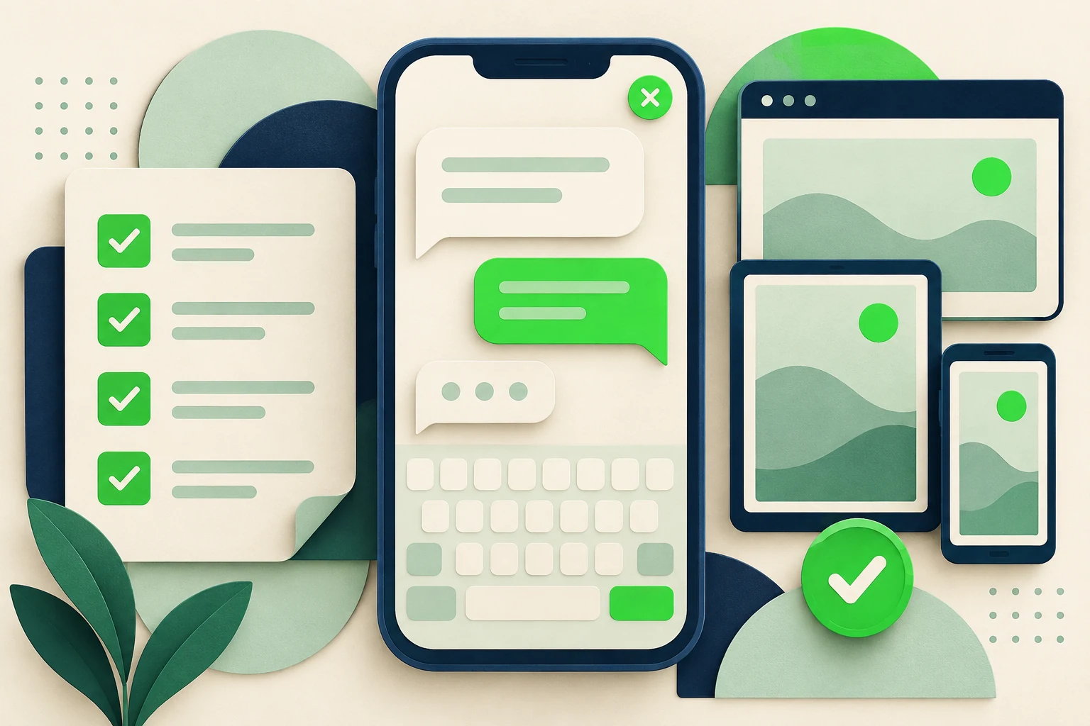
The AI answers the test question correctly on a laptop. On a phone, the customer opens the keyboard and can no longer see the last reply. Another visitor follows a booking link and cannot tell how to return to the conversation. Neither problem appears in an answer-accuracy spreadsheet.
Mobile AI front desk quality assurance checks whether someone can actually complete the conversation on the website you have deployed. It follows the experience from finding the launcher to reading, typing, using a link or optional form, and closing the panel. The question is not only “Was the answer correct?” but “Could the visitor use it?”
This guide provides a practical device review sheet and an interaction test sequence for small teams. The examples describe review situations, not defects claimed to exist in any particular product. It is not a formal accessibility certification or a substitute for specialist testing. Use it to catch visible friction, preserve evidence and give your site team a clear issue to reproduce.
What Is Mobile Front Desk QA?
Mobile front desk QA is a task-based review of the chat experience in the real page context. The reviewer opens the website, starts a conversation, reads and sends messages, follows the supported next step and returns to the page. Each action is checked on the devices and browsers relevant to the business's audience.
It differs from testing the AI's knowledge. A correct answer can be hidden behind an overlay. An accurate link can be difficult to tap. A sensible lead form can be awkward when the keyboard covers the field being edited. These are interaction problems, even when the conversation logic is sound.
It also differs from checking a widget in isolation. Your site may contain a cookie banner, sticky navigation, a booking button or another floating control. The combination matters. Test the AI front desk where customers will actually encounter it, not only on an empty demonstration page.
The chat widget guide covers broader selection and implementation considerations. The website embed guide explains installation. This review sheet begins after the embed is present and asks whether the complete mobile interaction works as intended.
Test a task, not a screenshot
A screenshot can show layout, but it cannot prove that typing, scrolling, following a link or returning to the conversation works. Record a short sequence of actions and the observed result for each important task.
Why Desktop Approval Misses Mobile Friction
Available space changes during the conversation
A phone's usable area is not static. The on-screen keyboard, browser controls and page overlays can change what the visitor sees. A layout that looks comfortable before typing may behave differently once a field has focus. Test those transitions rather than only the initial open state.
The conversation competes with the rest of the page
A launcher may overlap a primary website control or become hidden behind a banner. A chat panel can feel disconnected from the page if closing it leaves the visitor in an unexpected position. The site and widget need to be reviewed together because the customer experiences them together.
Real answers are longer than demo greetings
A short welcome message may fit neatly while a multi-paragraph answer, a link card or a clarification sequence creates awkward scrolling. Use realistic approved questions and at least one longer answer. Do not judge readability only from the greeting the team already knows by heart.
A successful tap is assumed to complete the task
Opening a booking page is not a completed booking. Submitting a form visually is not proof that the intended team received the enquiry. Interaction QA should distinguish what the browser displayed from what the workflow actually accomplished. Otherwise the report overstates the evidence.
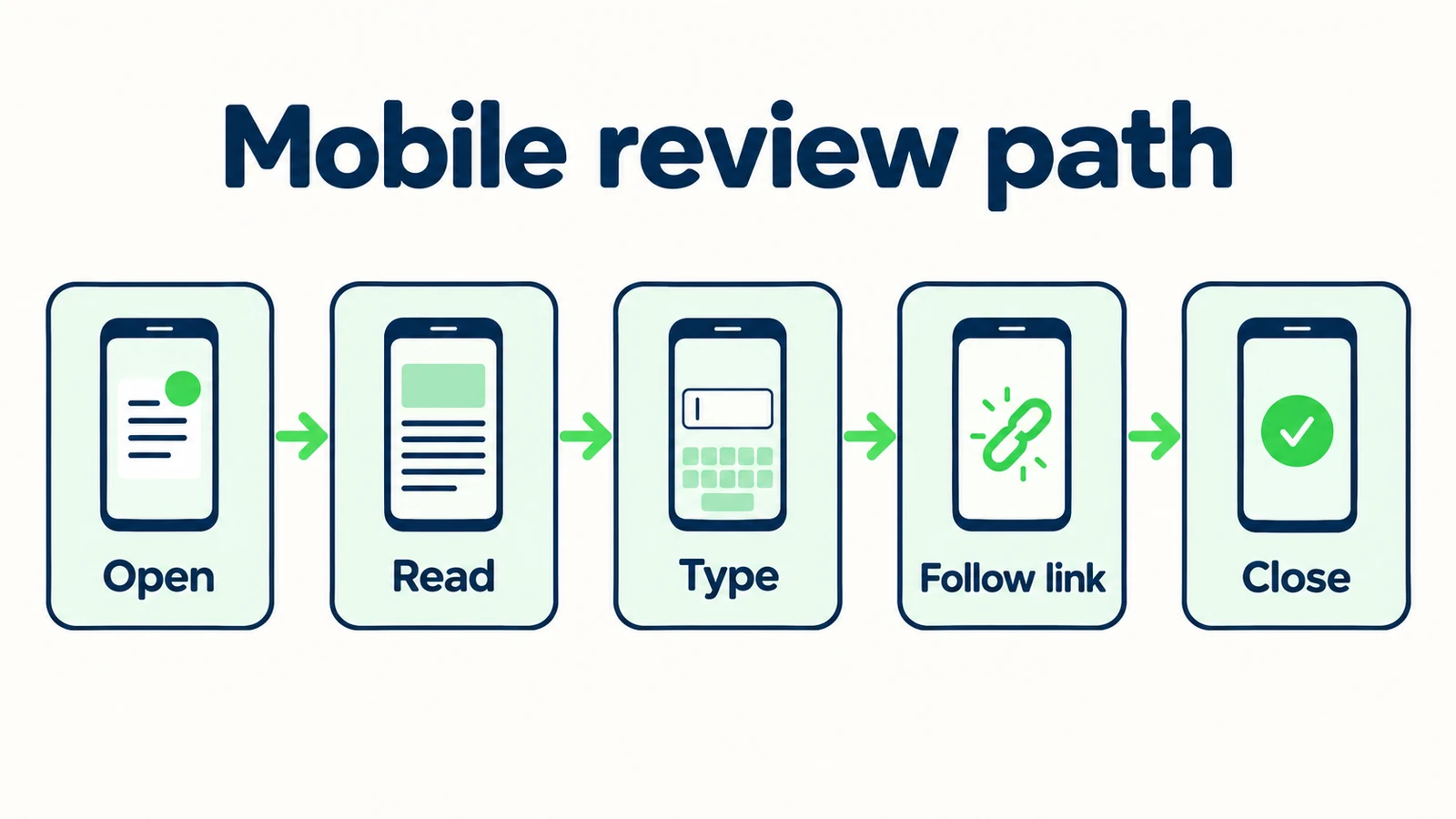
7 Mobile Checks to Run Before Calling the Experience Ready
1. Find and open the front desk in the actual page layout
Start with the page as a first-time visitor would see it. Check the launcher before and after interacting with any site banner that legitimately appears. Is its purpose understandable? Is it visible without covering another important control? Can the visitor open it with an ordinary tap?
Record the page and state rather than writing “launcher works.” A useful observation says, “On the service page, with the cookie banner visible, the launcher remains visible and opens the panel.” If it overlaps another control, capture that exact state so the site team can reproduce it.
Try the pages with different layouts: homepage, service or industry page, a long article and a contact page. You do not need to inspect every URL immediately, but avoid assuming that one page represents all sticky elements and content lengths.
For a home-services business, the mobile visitor may be reading a service description before asking a question. The launcher should support that task rather than obstruct the information. This is a usability review, not an instruction to add more attention-grabbing animation or a larger prompt to every page.
2. Read realistic replies without losing your place
Ask a question that produces an ordinary answer and another that requires a longer explanation. Review line length, text size, spacing and contrast in the actual rendered state. Look for clipped text, accidental horizontal scrolling and content that appears outside the panel.
Scroll through the conversation deliberately. Can you read an earlier answer and return to the newest message without confusing page scrolling with conversation scrolling? Does a new reply interrupt the part you are reading? Record the behavior you observe rather than assuming every movement is wrong; the issue is whether the visitor can understand and control the task.
Test a message containing a link and, if your deployment uses them, attached-asset previews. Labels should tell the visitor what the destination contains. Avoid judging the design by whether it resembles a desktop chat application. A compact mobile interface can be different and still work well.
Have a reviewer who did not write the source material read the answer. They are more likely to notice that an important condition is buried or a paragraph is difficult to scan. If the content itself is too long, improve the answer wording as well as investigating the layout.
3. Open the keyboard and complete a real message
Tap the input, type a realistic question, edit part of it and send it. Watch what happens when the keyboard appears. The active field, send control and relevant context should remain usable; if they do not, record the exact sequence and device state.
Test more than a short greeting. Type a question long enough to wrap, move the cursor and correct a word. Check whether the input grows or scrolls in a way the user can understand. An accidental page jump or hidden control may only appear during editing.
Then dismiss the keyboard and continue reading. Does the panel return to a sensible state? Can you reopen the input and ask a follow-up? Do not rely solely on a browser's desktop device preview for this check. A real phone interaction can expose behavior that a resized desktop window does not reproduce.
Avoid turning the report into speculation about the cause. “The latest reply is obscured after focusing the input on this device” is useful evidence. “The widget is broken on mobile” is too broad. Give the developer a reproducible task and observed result before proposing a technical fix.
4. Test page overlays and close controls together
Open and close the panel while the page is at different scroll positions. Check the close control's visibility and whether the visitor returns to a usable page state. A front desk should be easy to leave; a conversation is optional assistance, not a trap.
Review combinations that occur on your site, such as a cookie notice, sticky header, bottom booking button or announcement banner. Do not manufacture unlikely combinations solely to produce a long issue list, but do not ignore a conflict because each component looks fine by itself.
Use the site's normal controls to dismiss overlays. Do not hide them with developer tools and then call the customer experience verified. If your test requires a special state, document it. Evidence is only useful when another person understands the conditions under which it was collected.
After closing the front desk, reopen it and check the expected conversation state. Describe what actually persists without assuming a particular session feature. If returning from another page changes the conversation, determine whether that behavior matches the deployment's intended design and whether the visitor has enough context to continue.
5. Follow links and return to the conversation
Choose the links customers are most likely to use: an approved booking destination, a service page, a brochure or the contact route. Tap them on the phone and verify the destination. A link label that sounds correct is not proof that the URL is correct.
Check the return journey. Can the visitor get back to the conversation through ordinary browser navigation? Is the result understandable if the destination opens in a different tab or application? Record these outcomes as observed behavior, not as universal rules about how every link should open.
For booking, preserve the product boundary. With Calendly or Cal.com connected, Hyperleap AI books the slot in the conversation (on Pro and Max; on Plus, the agent shares your booking link) — on mobile, check that the website slot picker is tappable and that the confirmation is readable. With any other scheduling tool, it shares the approved link and the destination handles its own booking process; there, your QA report should say “booking destination opened” unless you separately tested and verified an actual booking flow.
Look at the destination's mobile presentation too. The front desk may be working correctly while an external form is difficult to use. Assign that issue to the appropriate owner. The customer still experiences the break in the journey, but the report should distinguish the chat interface from the linked system.
6. Exercise optional lead fields and correction paths
If your website deployment uses a lead form, test the configured fields with clearly fictional data. Read the labels and any explanations. Check that the form asks only for information appropriate to the task and that the visitor understands why it is requested.
Enter a value, correct it and test the visible response to an incomplete or invalid entry. Do not invent expectations about native validation features; compare the behavior with the form your team has actually configured. Record unclear feedback, hidden errors or a field that becomes difficult to edit on the device.
Keep website form behavior separate from messaging-channel behavior. A web lead form is not automatically the same interaction as an Instagram DM or WhatsApp conversation. Test the surface you intend to describe and avoid claiming a cross-channel result from a browser-only review.
Finally, verify the handoff separately. A confirmation displayed in the browser is evidence of a client-side state, not necessarily recipient delivery. If the test includes an authorized submission, confirm the resulting record or notification through the relevant system. The lead-summary guide explains what the receiving team should be able to use.
7. Repeat after orientation, navigation and meaningful changes
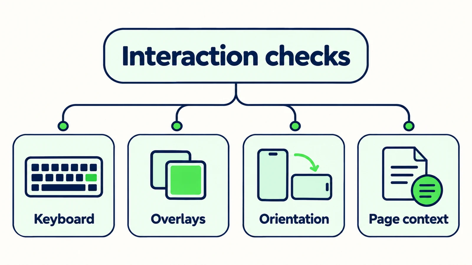
Repeat important tasks after a normal change in context, such as rotating the phone or navigating to another page and returning. The aim is to find transitions that leave the interface unusable, not to chase every theoretical device state.
Record the device, browser, page, orientation and test date. For a reproducible issue, add the action sequence and a screenshot or short recording that excludes personal data. A report without context can force the developer to spend more time recreating the environment than fixing the problem.
Retest after changes to the widget, site layout, consent banner or primary linked destinations. A previous pass does not prove a newly combined layout still works. Keep the original failing sequence so the reviewer can confirm the actual issue is resolved, rather than performing a different easier test.
The implementation checklist covers the broader launch process. Mobile interaction review is one gate within it. It complements source accuracy, handoff verification and operational ownership; none of those checks should be used as a substitute for the others.
Build a front desk customers can use
Start with approved answers, then review the complete conversation on your actual mobile pages.
Start for freeA Device Review Sheet That Produces Fixable Issues
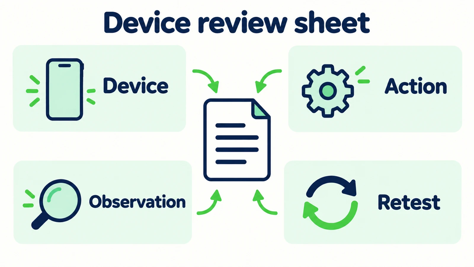
Use a row for a task on a specific test environment. The following entries are example checks, not measured results from a product deployment.
| Task | State to test | Evidence to record | Passing observation |
|---|---|---|---|
| Open panel | Service page with normal site overlays | Device, browser, screenshot | Launcher and panel can be used without an obstructed primary control |
| Read answer | Realistic multi-paragraph reply | Question and visible layout | Text is readable and the visitor can navigate the conversation |
| Type and edit | Keyboard open, wrapped input | Action sequence | Field and send action remain usable |
| Close and reopen | Page scrolled below the first screen | Before and after state | Visitor can return to the page and resume the intended task |
| Follow link | Approved booking or information destination | Actual destination and return path | Correct destination opens and the return journey is understandable |
| Complete optional form | Fictional data and a correction | Visible result plus separately verified delivery if tested | Fields and feedback are usable; delivery claims match evidence |
Add severity in plain business terms. “Blocks sending a question” is more actionable than “high priority” without an explanation. Distinguish a task blocker, a confusing interaction and a cosmetic issue. This helps a small team fix the most consequential problems first.
Keep failed cases in the report until they are retested. A change marked implemented is not the same as a verified pass. Record the version or deployment reviewed, and avoid silently mixing screenshots from different states into one result.
The useful outcome is a list of reproduced issues and verified tasks, not a universal claim that the experience works on every device. State the coverage honestly. A focused review on relevant real devices is valuable when its limits are clear.
Run a Practical Review With a Small Team
Choose devices and browsers from your own audience evidence where available. If you do not have that information, begin with the real phones your team can access and document the gap. Do not fabricate market-share coverage or treat a desktop emulator as proof of every mobile environment.
Create a short set of approved customer tasks. Include a routine question, a longer explanation, a link-based next step and an optional enquiry submission if your deployment uses one. Use synthetic details and avoid sending test messages to real customers.
Have one person perform the task while another records the result if practical. The observer can notice hesitation, repeated taps or confusing wording that the tester might otherwise forget. Keep the exercise focused on the task rather than debating visual taste.
Separate ownership of findings. Source wording belongs with the content owner. Page overlap may involve the site team. An external booking destination has its own owner. Notification delivery may require a different verification path. The handoff guide is useful for that last part: the customer-facing promise must match the real workflow.
Hyperleap AI's quick-start path can put an agent live in under five minutes; interaction review is the tuning and verification you perform around your actual website experience. Do not confuse a fast embed with completed acceptance testing. When a fix is made, rerun the same task, record the new result and keep any remaining limitation visible to the launch owner.
Frequently Asked Questions
Is a responsive desktop preview enough for mobile QA?
It is useful for layout checks, but it should not be the only evidence. Test important interactions on real phones, especially typing, keyboard changes and link navigation. Document which environments you actually reviewed.
Should we test every page on the website?
Start with representative pages that have different layouts and important customer tasks. Include the pages where the front desk is most likely to be used. Expand the review when you find a page-specific conflict or introduce a new layout pattern.
Does a correct AI answer count as a passed mobile test?
Not by itself. The visitor must be able to read the answer, continue the conversation and use the intended next step. Answer quality and interaction quality are separate checks that should both be reviewed.
What should we record when the keyboard causes a problem?
Record the device, browser, page, orientation and exact sequence that produced the issue. Describe what became hidden or unusable and include appropriate visual evidence without personal data. Avoid guessing the technical cause before the issue is reproduced.
Does a form success message prove the team received the lead?
No. It proves only the visible state you observed. If delivery is in scope for an authorized test, verify the resulting record or notification separately. Report browser behavior and recipient delivery as distinct evidence.
Is this review an accessibility certification?
No. It is a practical interaction checklist for finding visible friction and creating reproducible issues. Formal accessibility evaluation can require specialist methods and broader coverage. Do not use a passed checklist to make an unsupported compliance claim.
Review the Conversation Where Customers Actually Use It
Mobile front desk QA is most useful when it follows a real task through the whole interaction. Open, read, type, follow the next step and return. Check the changes between those states, not only the attractive first screen.
The worksheet turns “it feels awkward on my phone” into evidence a team can act on. It also prevents overclaiming: a link opened, a form displayed success and a notification arrived are different results. Record each one only when verified.
An AI front desk should help customers move forward from the page they are already reading. Give it approved knowledge, then make sure the mobile experience lets them use that knowledge without unnecessary friction.
Start with useful answers and test the experience
Create your AI front desk, then use the review sheet to check the real mobile journey before expanding it.
Start for freeIndustry Solutions
See how AI chatbots work for these industries:
Related Articles

AI Front Desk Welcome Messages: Examples That Help
Write useful AI front desk welcome messages with practical examples, clear capability boundaries and a checklist for your website greeting.

AI Front Desk Leads to CSV: A Follow-Up Workflow
Turn a chatbot lead export into a usable follow-up list with field checks, careful deduplication, clear ownership and a synthetic CSV example.

Seller Enquiries: A Real Estate Intake Template
Use a seller enquiry template to capture property type, broad area, timing and the next agent conversation without promising valuations or collecting documents.

Hotel Accessibility Questions: A Source Sheet
Prepare factual hotel accessibility answers with a source sheet for entrances, room features, measurements, review dates and named staff follow-up.